Valley Credit Union – Custer Branch
DESCRIPTION
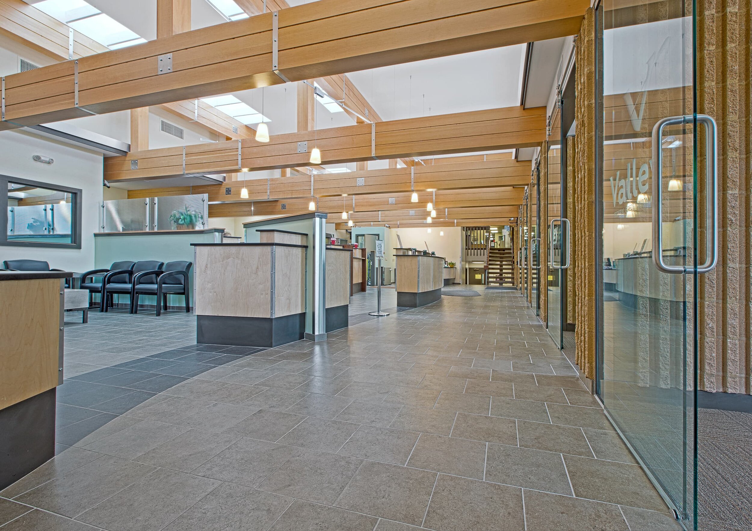
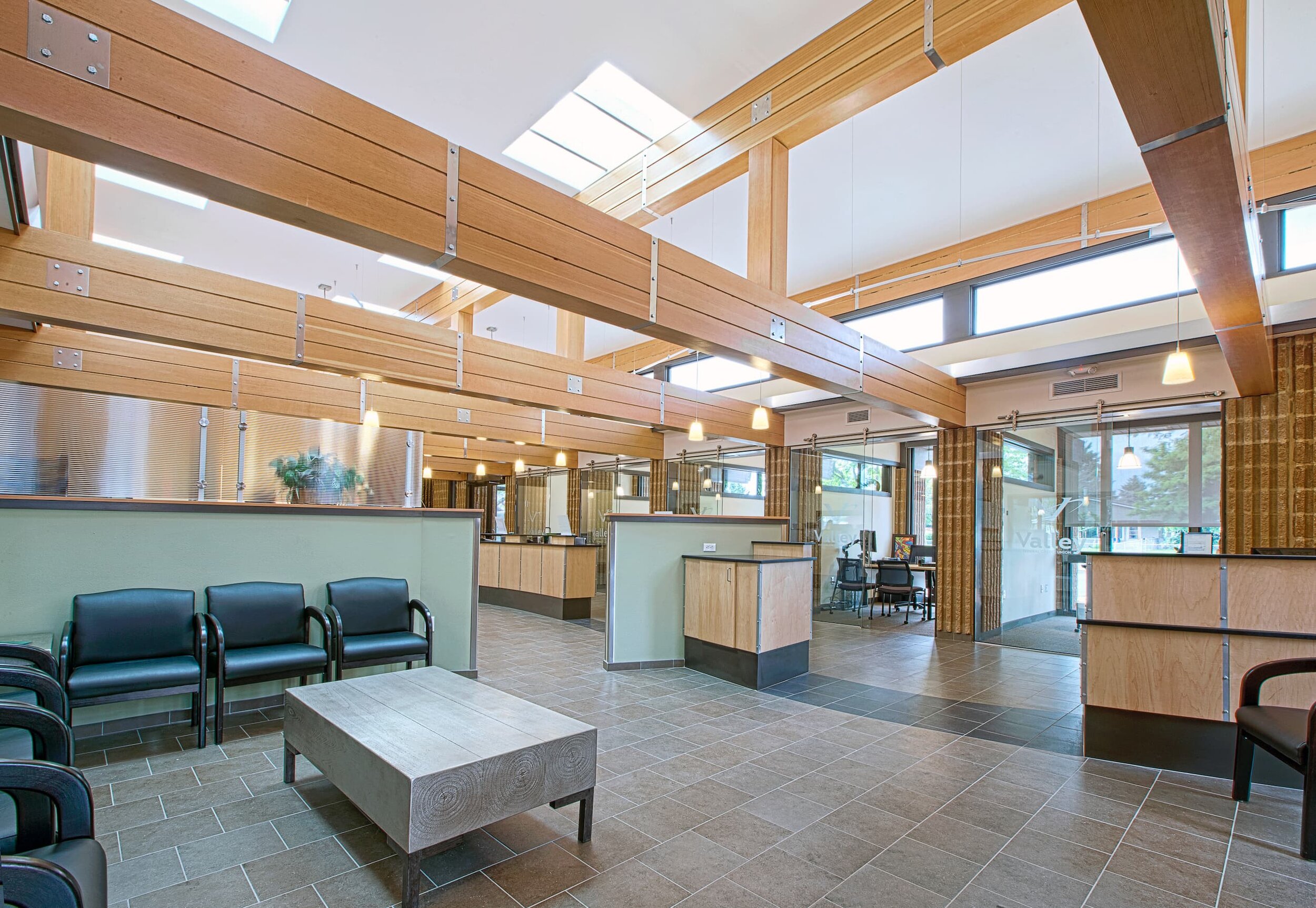
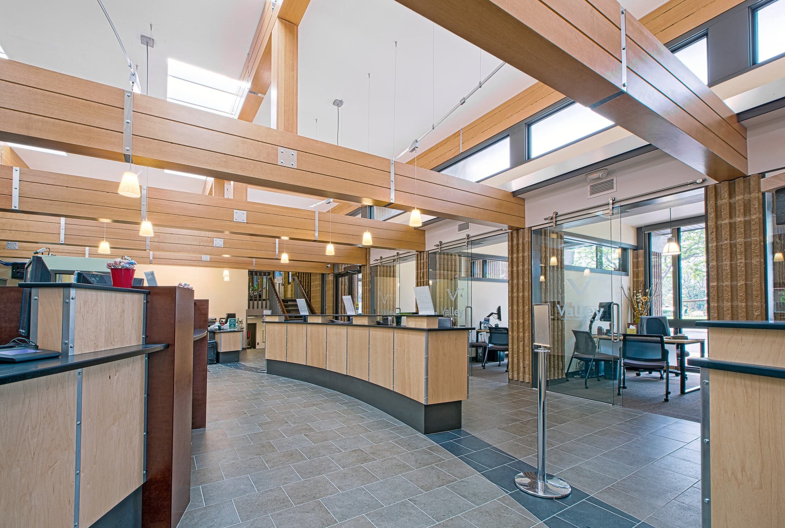
Valley Federal Credit Union came to High Plains Architects to help update its branch location at Custer Avenue. The last remodel work had occurred in the early 1990s and functional requirements and their spatial implications had changed over time. Moreover, the space, which felt gloomy despite high levels of lighting, was in dire need of lighting and aesthetic upgrades to create a quality space for credit union members and employees to conduct their business. The low-hanging beams had surface-mounted wiring for data, speakers, additional lighting, and security cameras crawling over them. Exposed ductwork was peeking from behind a beam. The collective assemblage was best summed up with the word “cacophony.”
STRATEGIEs
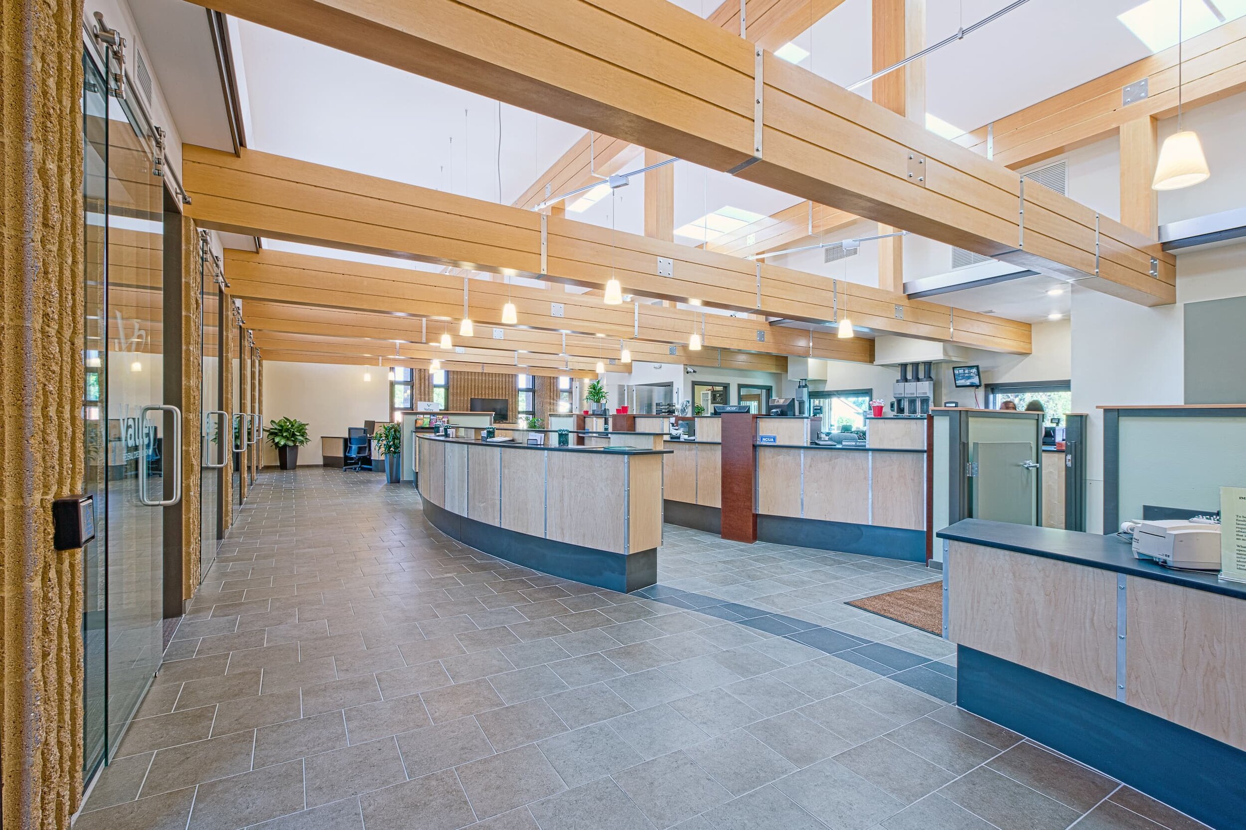
Spatial Articulation: While High Plains Architects has designed a number of loft-style projects in which ductwork is typically visible along with structural members, we felt a different approach was needed here. We *gasp* dropped a ceiling to cover the ductwork and aligned some partition walls strategically to articulate dominant and subordinate volumes, creating a more soothing, easily comprehended space.
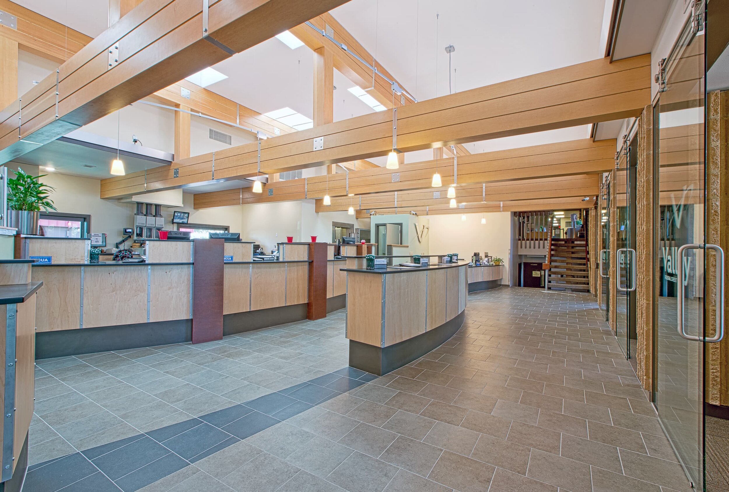
User Experience Consideration: We carefully thought through the experience of arriving at the lobby and feeling welcomed. Do I see the faces of staff to be greeted? Does the space give me clues on where to go? How does it feel to stand at a teller station with people lining up after me? This process helped inform the layout and shape of the reception desk, checkstand, computer kiosk, waiting area, and teller stations.
Daylight: The Venetian blinds were removed and ridged diffusing glass was put in the clerestory windows. This additional daylight was balanced by adding eight skylights over the middle of the space. The result not only markedly reduced electricity for lighting but also dramatically increased the quality of the space. This is now a space to which employees and credit union members alike are drawn.
Quality of Space: We felt the existing rectilinear rigor of the beam and pier layout needed a graceful counterpoint, so designed the reception desk, checkstand, and teller stations as a curving “wave”. The materials were selected for a balance of the warmth of the Douglas fir and maple against cooler slate tile flooring and wall colors.
High Performance: All building elements were selected to reduce energy and water use while simultaneously improving the quality of the space. Additional insulation was blown into ceiling cavities; new high performance glazing was installed, lighting energy was dramatically decreased through daylighting and LED fixtures, and the restroom’s dual flush toilet substantially decreases water use.
LOCATION
Billings, Montana
CLIENT
Valley Federal Credit Union
SIZE
2650 square feet
COMPLETED
2015
PROJECT HIGHLIGHTS
Lobby Remode
